I’m a massive Apple fan and therefore a massive fan of legendary British designer, Sir Jonathan Ive .

One of my favourite quotes from him is:
“We try to develop products that seem somehow inevitable. That leave you with the sense that that’s the only possible solution that makes sense,” he explains. “Our products are tools and we don’t want design to get in the way. We’re trying to bring simplicity and clarity, we’re trying to order the products.
“I think subconsciously people are remarkably discerning. I think that they can sense care.”
Great design is design where the user instinctively knows what to do with it. It is, in Jony Ive’s words, inevitable. All design leads the user to action – whether that be to sit on a beautifully crafted chair, hit a nail with a solid hammer or move something with wheels. But how often do you, as the user, feel forgotten about? Like the product you’re using is one of millions, made impersonally, isn’t easy to use, uncomfortable, cheap, or you just have no idea what on earth you’re supposed to do as a result of this piece of design. Nasty. Poorly designed.
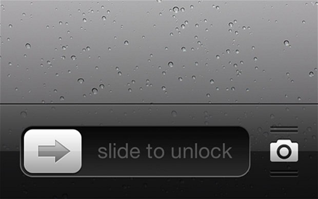
Perhaps one of the greatest designs of the 21st Century is ‘slide to unlock’.

I know I’m an Apple nut. Personally I love iOS 7…although ‘slide to unlock’ is part of the old-school design from Scott Forstall who was unceremoniously ejected from Apple after apparently refusing to apologise for the Apple maps fiasco (although they’re now pretty good – so much more data and look so much better than Google maps).
You have to remember at the time that no one had any idea what to do with a multi-touch smartphone so it had to take skeuomorphic cues from the real world – a calendar that flipped the pages, a notebook with yellow paper, lines and handwritten style fonts, a metalic looking calculator. This all made sense in 2007 because we, as an audience, knew how to interact with it. The finest example is ‘slide to unlock’. The simple arrow block in a slider with the glowing words was beautiful, inevitable and obvious and changed the world – makes you wonder how on earth you could unlock a smartphone without it (# 9 or whatever it used to be when phones had buttons). We all take it for granted now, but you just have to watch the response in the audience when Steve Jobs unlocks the first iPhone – this was genuine awe!
What do you want your user to FEEL?
I believe one of the most important, yet undervalued elements of design is feeling. Thinking about what you want a user to feel or experience when you design something can massively effect what you do with the design. Yes, they need to know how to use the item and the design provides the cues and calls to action – but how do you want the user to feel? Special? Motivated? Powerful? Scared? Excited? Defining what you want the user to feel can massively affect the design and this is far too often forgotten in the mire of ‘features’.
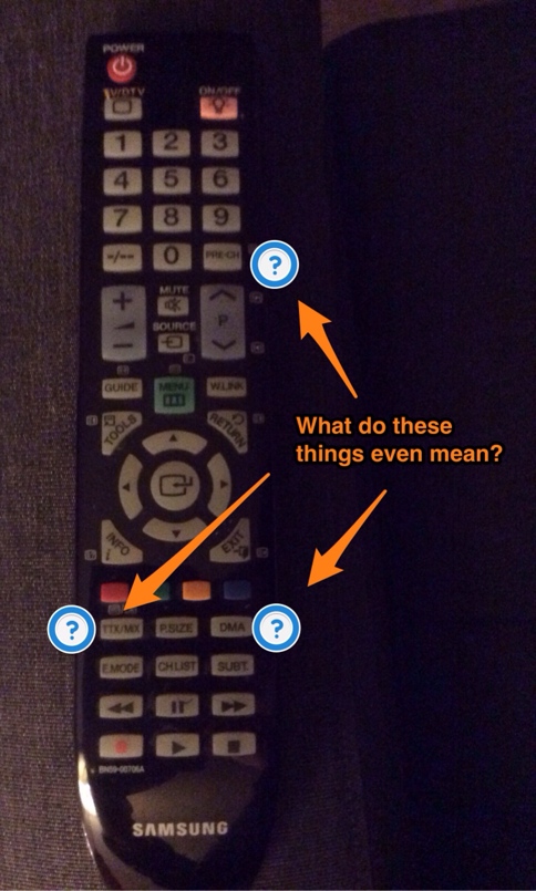
The finest examples of poor design are the ridiculously feature-heavy TV remote controls. Stupid bloody things. I mean, just looking at mine now…what the hell is ‘PRE CH’, ‘TTX’, ‘DMA’?

What I want is to turn the telly on, choose a channel and adjust the volume. That’s about it. I want the TV to be clever enough to know the rest. I loved that when I had BOSE speakers in my car. You couldn’t go faffing about with graphic equalisers – it was just varying degrees of beautiful sounding loudness. That’s great sound design. They’d thought about me the user – I felt great about the music (and their brand) because I didn’t need to be a sound engineer to set it up – they’d done that for me…that’s why the speakers cost money…
This myth that feature-fat and free-to-setup products are somehow better for the user is only true if you’re an expert with the product (or want to learn). It’s another reason why I’m on the iOS side rather than the Android side… I don’t claim that iOS is perfection nor that Android is useless…more that the way companies develop and promote these are more and more like feature lists and not experiences or feelings. I feel that, as an iOS user, Apple have thought about making the experience of using an iPad or iPhone as brilliant as possible – all the settings are under ‘settings‘, all my notifications are in the ‘notification centre‘, etc. I don’t have to wade through random tiers of menus to get where I want to like, in my experience, it feels like I have to with Android. I mean…take the example of the recent Samsung Galaxy S4 launch. Apart from being one of the most cringy pieces of theatrical nonsense I’ve seen for ages, they sold the whole thing on the feature list…I mean, a picture where you can record a sound? That’s called a video…just make a video…we can share videos now you know… Then there’s the HTC One where people marvelled at its so-called unibody design (although it looks like it’s lots of pieces) because it’s so simple and attractive…and like an iPhone…aah well, what do I know?
I love good, well thought through, caring, feeling design. Don’t you?
What is the best piece of design you have seen recently?

Leave a comment